Pur Juuce.
Graphic Design
November 2024


Brief:
Pur Juuce is a fictional canned juice brand that celebrates bold, natural flavors with the simplest ingredients. The brand emphasizes purity and quality, offering a refreshing and wholesome experience to its consumers.
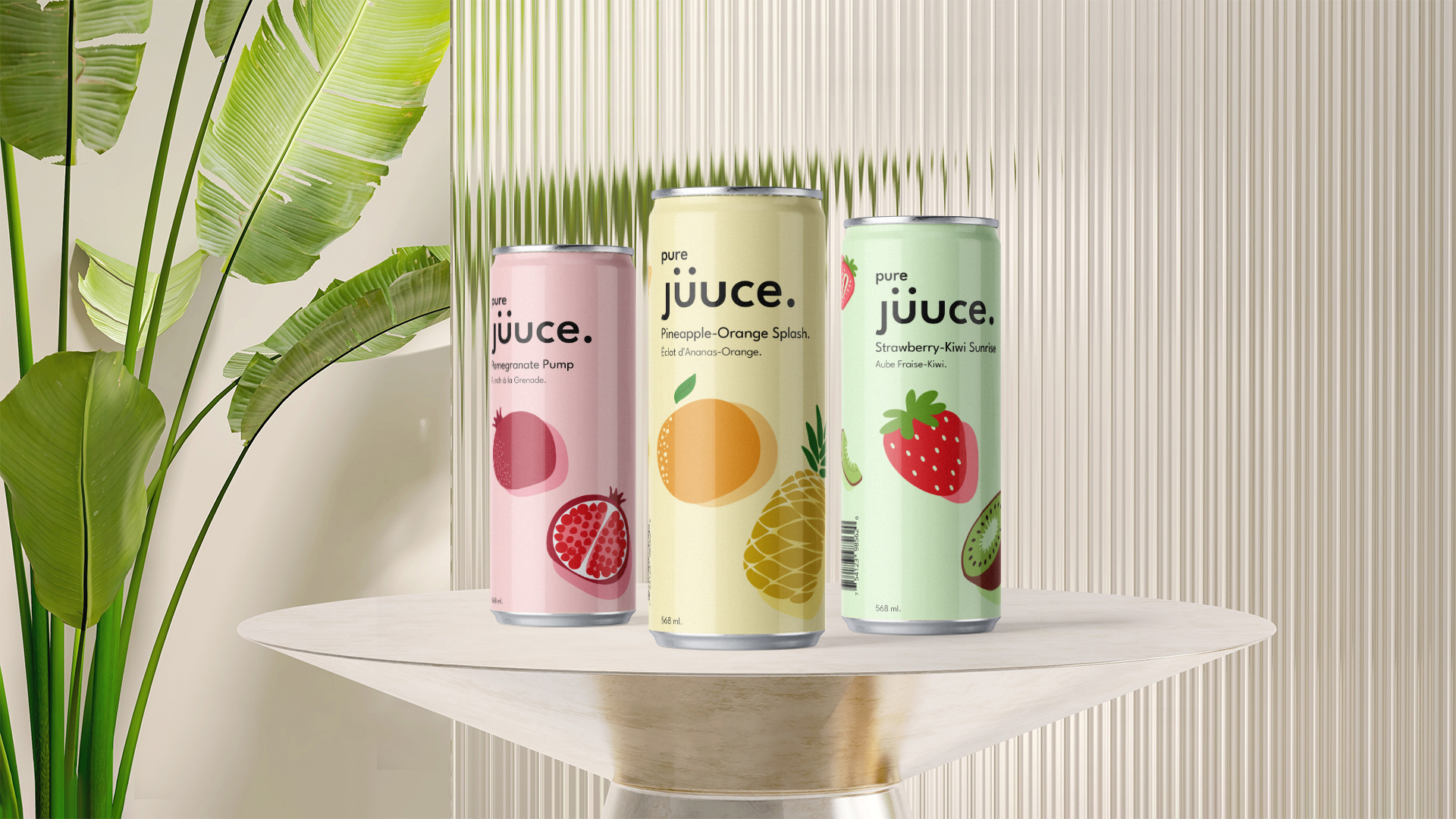
The Design
The design of Pur Juuce cans stems from hand-drawn inspiration, with a modern twist on it, with a careful balance between the two. One of the biggest challenges was refining the fruit illustrations, ensuring they retained the charm of hand-drawn artwork while still feeling polished and contemporary. By combining organic illustrations with a sleek, modern aesthetic, it creates a sense of connection between nature and the can itself. Each can contains a cohesive color palette, clean artwork that all ties back to the pure ingredients inside the can.
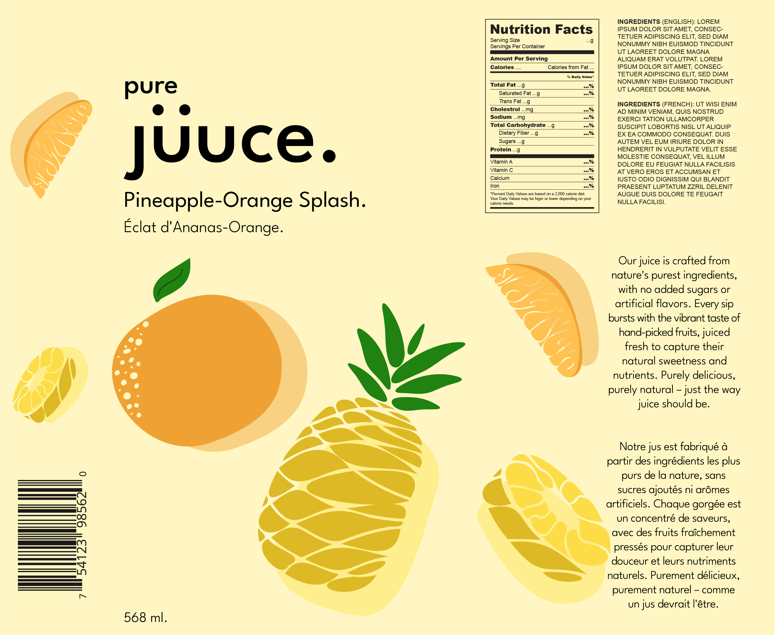
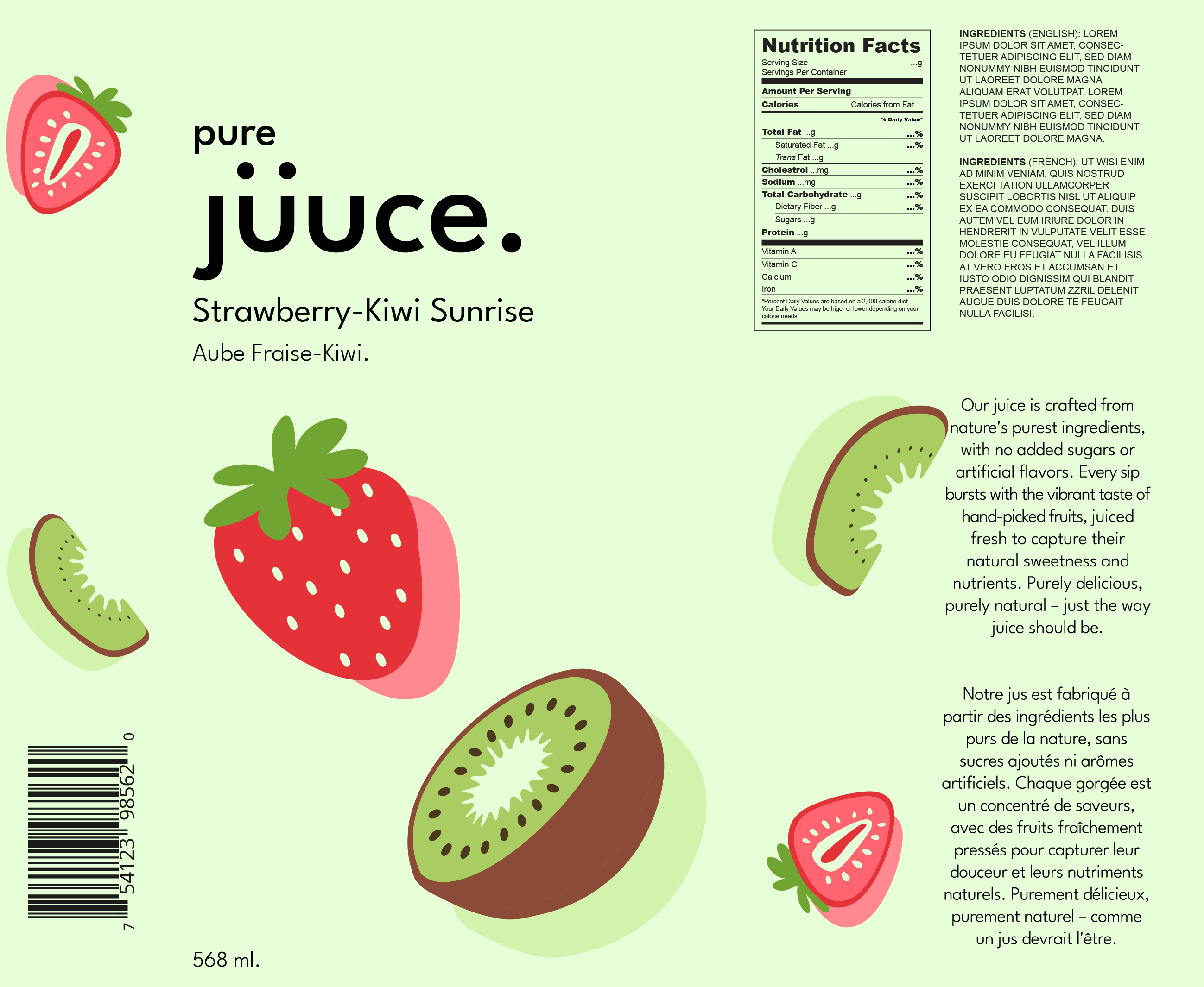
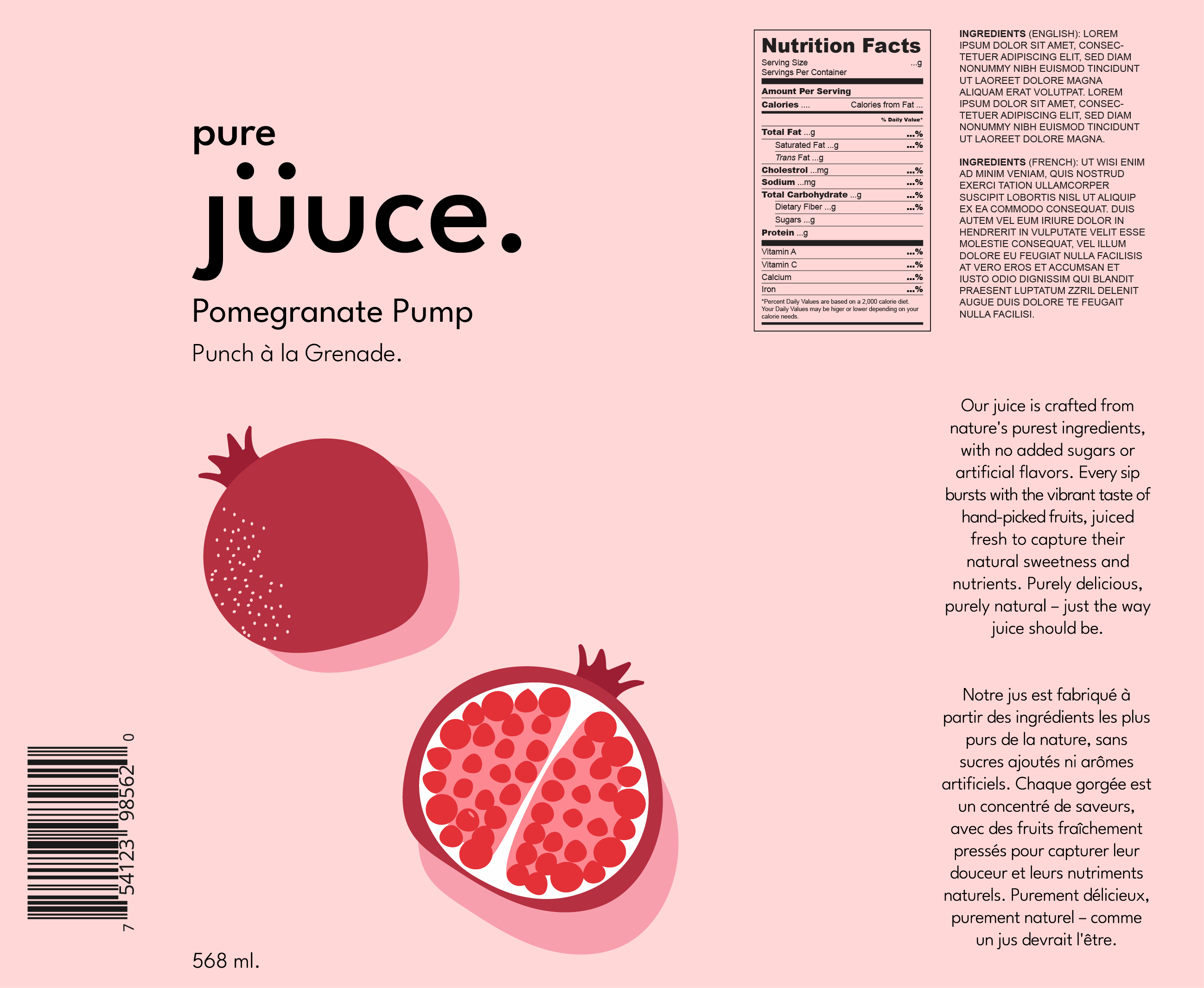
Branding
Pur Juuce blends minimalism with vibrancy, reflecting the purity of its ingredients. The bold League Spartan typography keeps the look modern and clean, while the curated color palettes highlight each juice’s fresh flavors. Soft pastels contrast with rich tones, striking a balance between natural and contemporary aesthetics. This cohesive design ensures Pur Juuce stands out with a fresh, approachable identity.


