Sunnys Menu.
Graphic Design
April 2024
Brief:
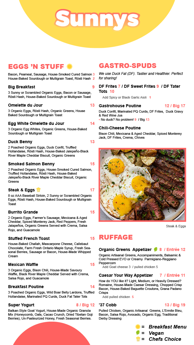
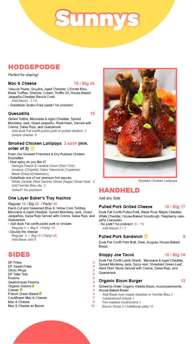
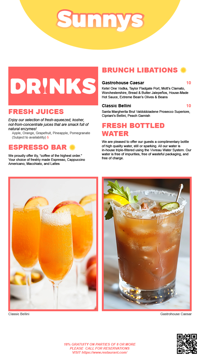
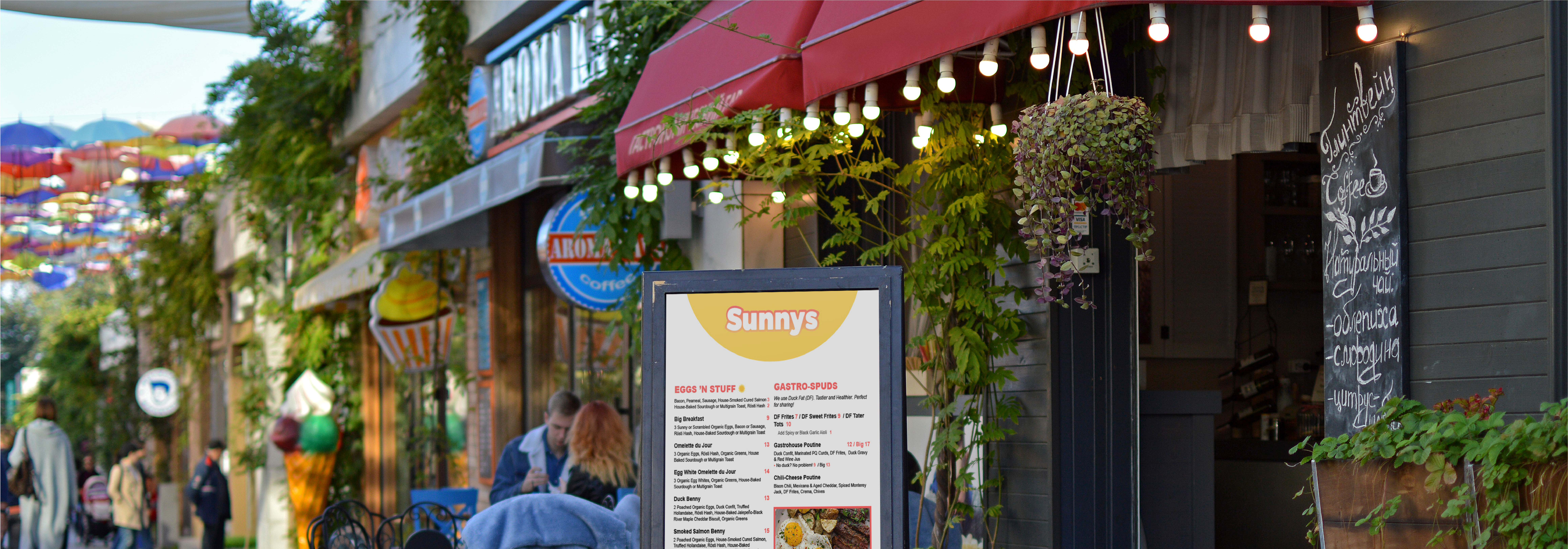
The Sunnys menu combines a playful yet modern design with a warm, inviting aesthetic. Bold typography, vibrant colors, and well-organized sections create a visually engaging experience. High-quality food photography highlights signature dishes, while clear layouts ensure easy navigation. The design reflects the restaurant’s fun, indulgent, and gourmet approach to brunch.
The Design
Designing the Sunnys menu required a careful balance between playfulness and clarity, particularly when establishing a clear text hierarchy. One of the biggest challenges was ensuring that key information—such as section headers and item descriptions—stood out without overwhelming the layout. To tackle this, I experimented with different text styles, adjusting weight, size, and spacing to create a hierarchy that guided the reader naturally. Finding the right contrast was another key consideration; I used bold, rounded typography for headings in bright red and yellow to make categories pop against the clean white background. Spacing played a crucial role in preventing visual clutter, ensuring the menu remained structured yet dynamic. Through iterative refinements, I was able to create a design that not only reflects the restaurant’s fun and inviting brand but also makes navigation effortless for customers.


